Earlier this year my local Modern Quilt Guild, The Central Ohio MQG, issued a member challenge to create a two color quilt. This challenge was a little different than many two color challenges because we were permitted to embrace all values of the colors we selected. I ultimately selected blue and turquoise as my colors, but it took me awhile to get there!

Initially, I intended to keep it simple with two colors and no value shift, but as the design evolved, so did my color plan. I have been wanting to make a red and white quilt, and I thought this would be a great project for that color scheme. As you can see, I ended up going with almost the complete opposite of the original color story.
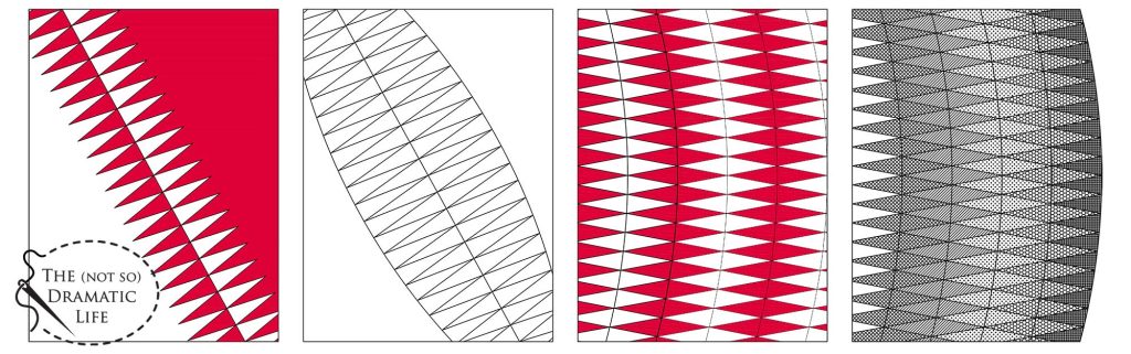
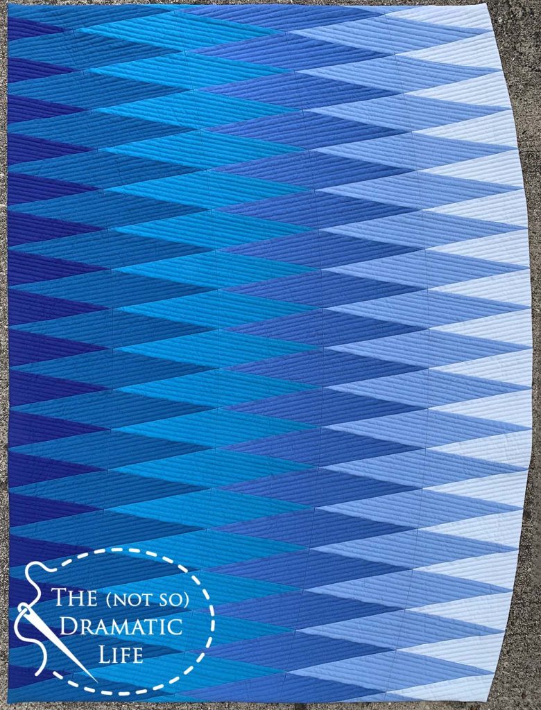
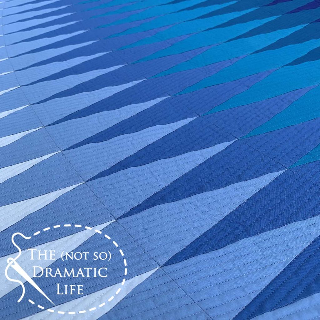
The design started with rows of triangles on an angle surrounded by negative space, but it felt a little too expected for my taste, so I added a curve to the edges of the triangles. This was better, but the strong diagonal across the quilt seemed to be trying too hard, so I shifted the columns to a vertical position. Once the overall design started to come together, I decided to remove the partial row seen at the top and bottom of the right hand row. The resulting design paired triangles up to form diamond shapes and gave the illusion of the shapes flowing into one another. This fluid effect lead me select the final color scheme of blue and turquoise that evokes the feeling of an ocean wave.
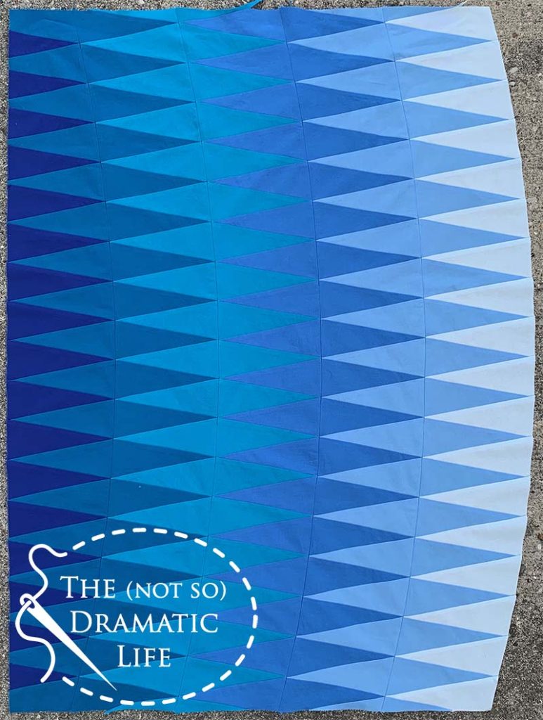
Each row of triangles is foundation paper pieced before being assembled into the final top using traditional machine piecing.
Here is the final quilt top with all of the paper foundations removed.
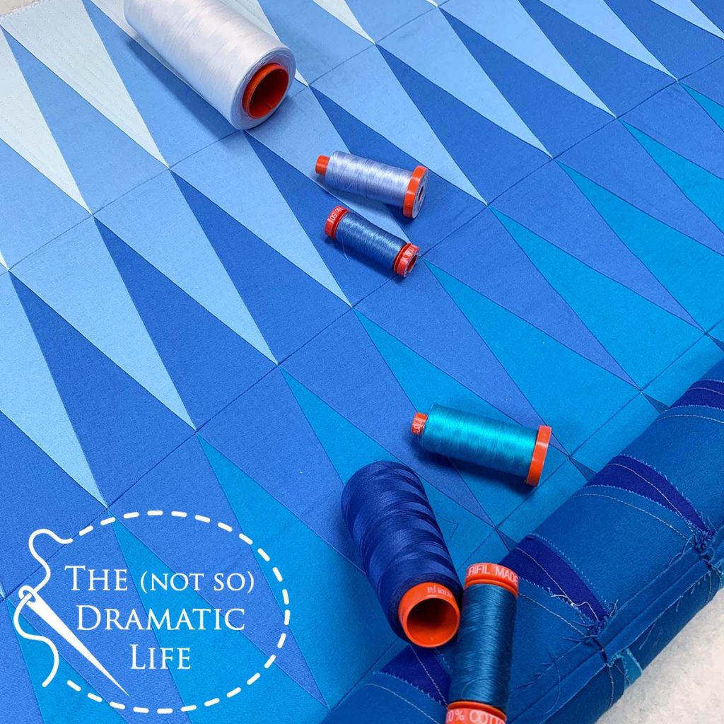
Color selection was critical to the design of the quilt, so I wanted to make sure the quilting thread melded into each color in the quilt without distracting from the overall aesthetic. Luckily I had thread in the appropriate colors on hand to match each fabric color in the quilt. Using a 50 weight thread to quilt also helps to blend with the fabric colors because of the relatively fine weight.
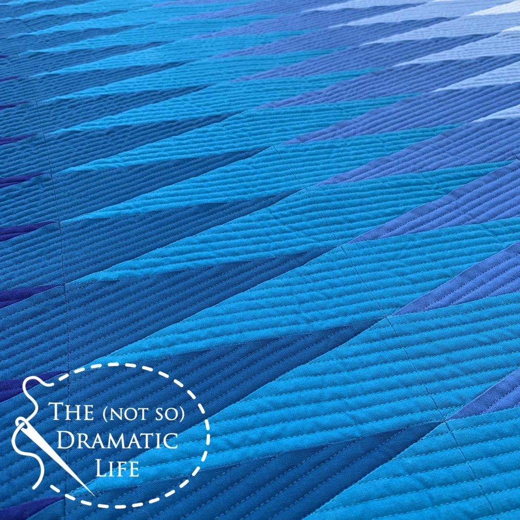
I used ruler work quilting to emphasize the angular quality of the piecing and alternated the direction to increase the wave-like feeling.
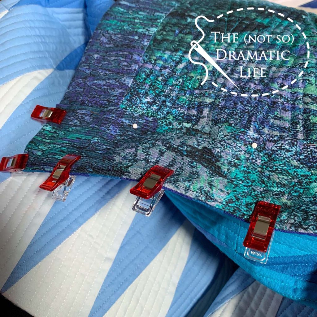
The overall design draws your eye across the quilt, and I didn’t want to create a frame with binding that prevents the viewer from experiencing this effect. Using a facing works well for this type of design. I cut the facings for the three straight cut edges on the grain of the fabric and used a bias cut strip for the curve.
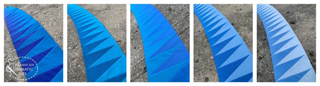
The curved piecing lines are subtle when viewing the quilt directly from the front. At first glance, the curve along the right hand side of the quilt may be the only indication that the quilt includes anything except straight lines and sharp angles.
When looking at the quilt closely or at an angle the pieced curves become more evident.
I am planning to enter this quilt in a few upcoming shows, so with any luck, some of you may get to see it in person!
Quilt Stats
Title: Oscillation
Size: 30″ x 39″
Techniques: Foundation paper piecing, machine piecing
Quilting: Ruler quilting on an A-1 longarm
Fabric: Paintbrush Studios Painter’s Palette Solids
Batting: Hobbs 80/20 Cotton/Poly blend
Thread: 50wt Aurifil thread in six colors
Binding: Faced edges to match the backing fabric